AUTHOR’S NOTE: The four classical elements (Fire, Water, Air and Earth) were assigned an elaborate color scheme in four “Scales” formulated by the Hermetic Order of the Golden Dawn using Qabalistic and magical principles, but a more fundamental arrangement going back to an earlier time asserted only that Fire is represented by Red, Water by Blue, Air by Yellow and Earth by Black, Brown or Green.
Because many tarot deck creators (including those who present their work as “esoteric”) lean strongly toward development of the symbolic imagery and don’t put as much effort into maintaining correct color associations throughout unless those are used mainly as background themes, it’s easy for the user to lose sight of their significance to the interpretation. Supplementing this scenario with the opinion of digital artists that the four primary colors are actually Magenta, Cyan, Yellow and Black, we have a recipe for much confusion.
In my own simplified tarot artwork, I stay with depicting Fire in vibrant tones of deep Crimson and bright Gold; Water in calming hues of Teal or Sea-Green, and Air as a clear, radiant Yellow or Sky-Blue. With Earth I depart from the Golden Dawn’s pattern of four equal segments populated by Black, Russet, Olive and Citrine (a yellow-green), and instead go with the luxuriant Emerald Green or rich Brown of the Empress. To the extent that I consider it, Spirit is usually rendered as White or Silver.
According to conventional color theory as I learned it in art school, hues are the purest expression of the primary and secondary colors, shades are muted abridgements achieved by the addition of black pigment, and tints are similarly toned down by infusing the original hues with white pigment. Shades and tints have their uses because they can help to create three-dimensional volume in a picture. This has little to do with occult color symbolism but can add nuance to its study and practical application, and it may have some relevance to the complex iterations described in the Golden Dawn’s exhaustive “Scales.” A more understated but no less spiritually sophisticated model is offered by the Hindu tattwas and their “flashing” dualism, but a detailed explanation of that is not my purpose here.
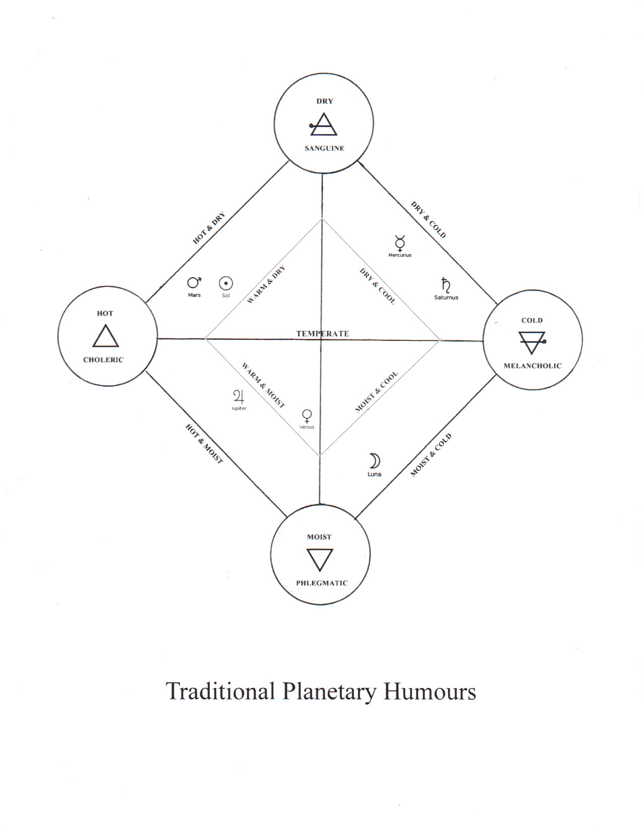
When I divine with the tarot, I don’t go much beyond these core principles, bringing them to bear on the nature of the cards in human and universal terms. The Greco-Roman proto-psychological concept of “humours or temperaments” (which was superseded by modern psychology in the 1850s) can aid in making these calls. From my own esoteric and artistic perspective, the Choleric elemental temperament is hot and dry, relating to the fiery planets of the Sun and Mars and the color Red; a Sanguine temperament is warm and dry, vibrating to Yellow, with Jupiter as a subtle Orange-Violet and Venus as a soft Yellow-Brown tinted with Green (aka “Ocher”) entering the “Temperate” zone from the “Warm and Moist” side where Yellow, Red and Blue mingle in various proportions; the Phlegmatic temperament is cool-to-cold and moist, represented by Blue and primarily reflecting the Moon; and the Melancholic temperament is cold and dry, with Saturn projecting solid Black or a profoundly “inky” Indigo as its apotheosis and Mercury “Hermes” (its faint “Evening Star” mode) as a dim Twilight Blue coming in a distant second from the Sanguine direction.
If you’re so inclined, William Lilly’s Christian Astrology (which isn’t all that religious but I think the title kept the Church off his back) is a good place to explore these characteristics. I once created a diagram that attempted to capture them in a visual way that is more layered than other versions; it is far from perfect and needs a make-over to tighten up on the planetary allocations based on my current thinking about Jupiter and Venus (they should encroach more on “Sanguine” territory), but it gives a general idea of the scope.